USC&A Rebrand

A visual rebrand & digital rebuild of The Commons at VCU, rooted in iconic imagery already familiar to the university community, in order to clearly communicate its purpose: to serve students.

University Student Commons & Activities at VCU

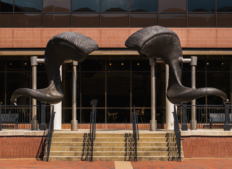
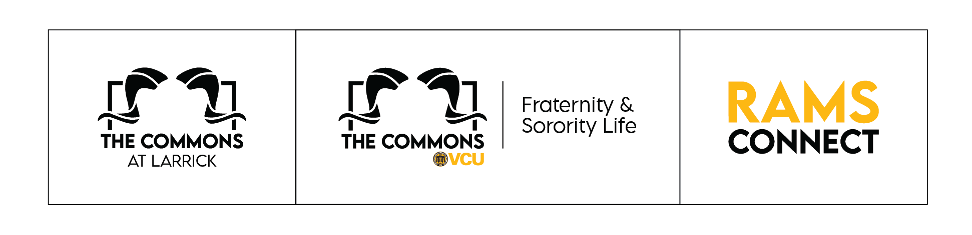
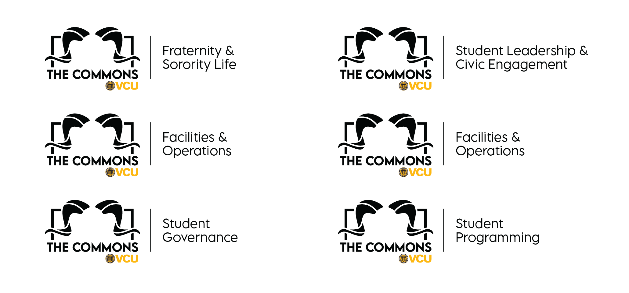
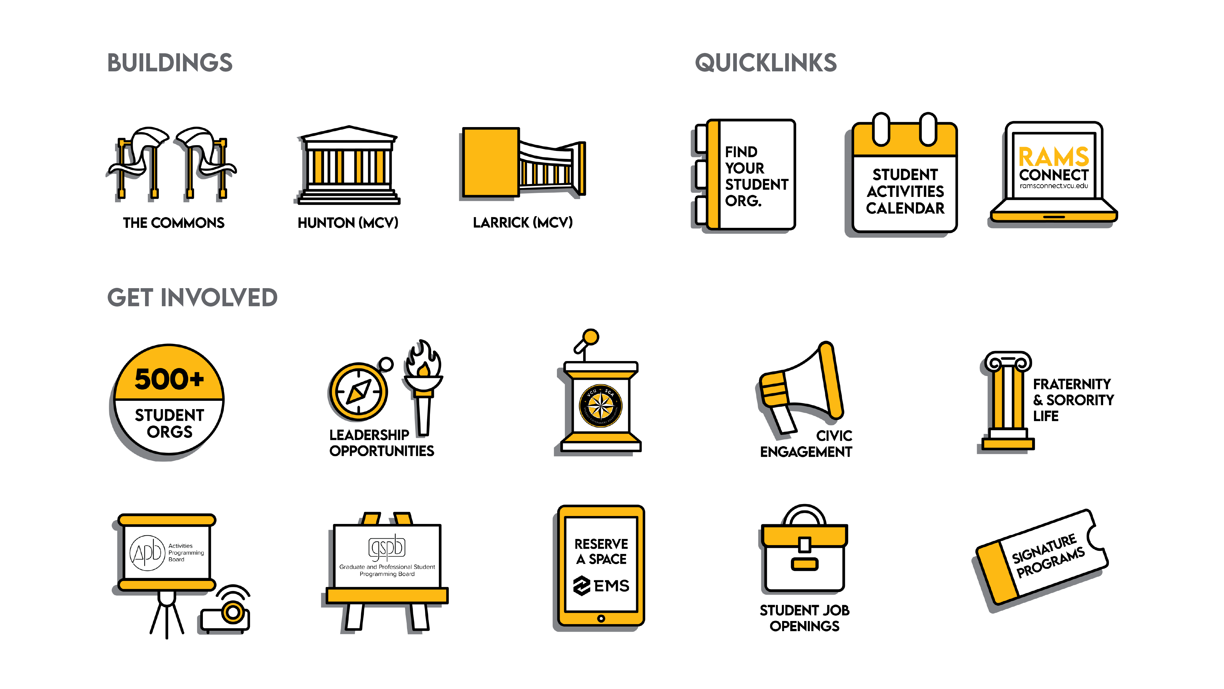
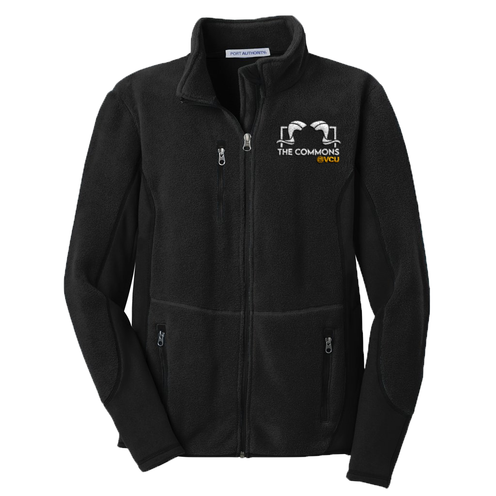
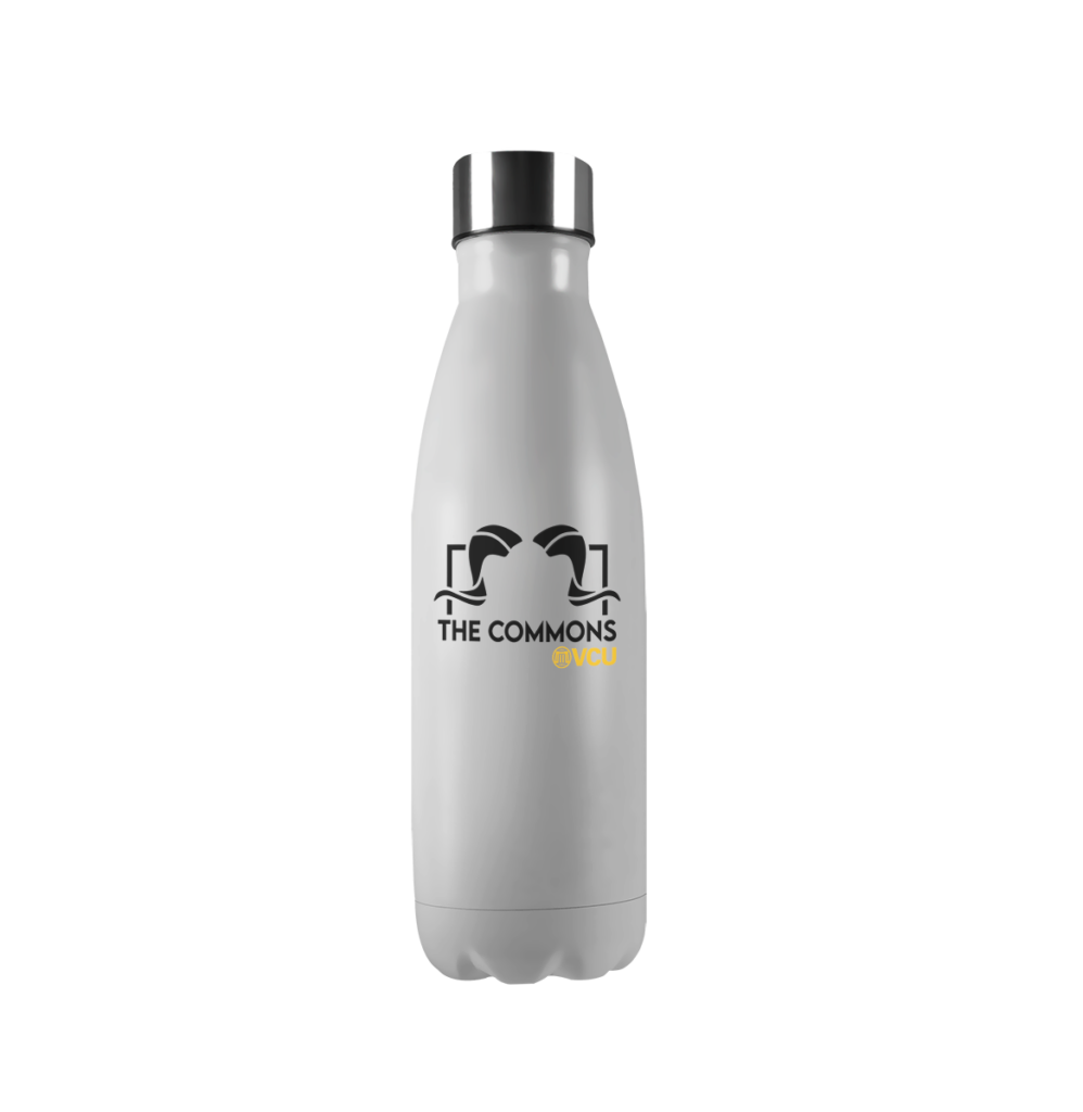
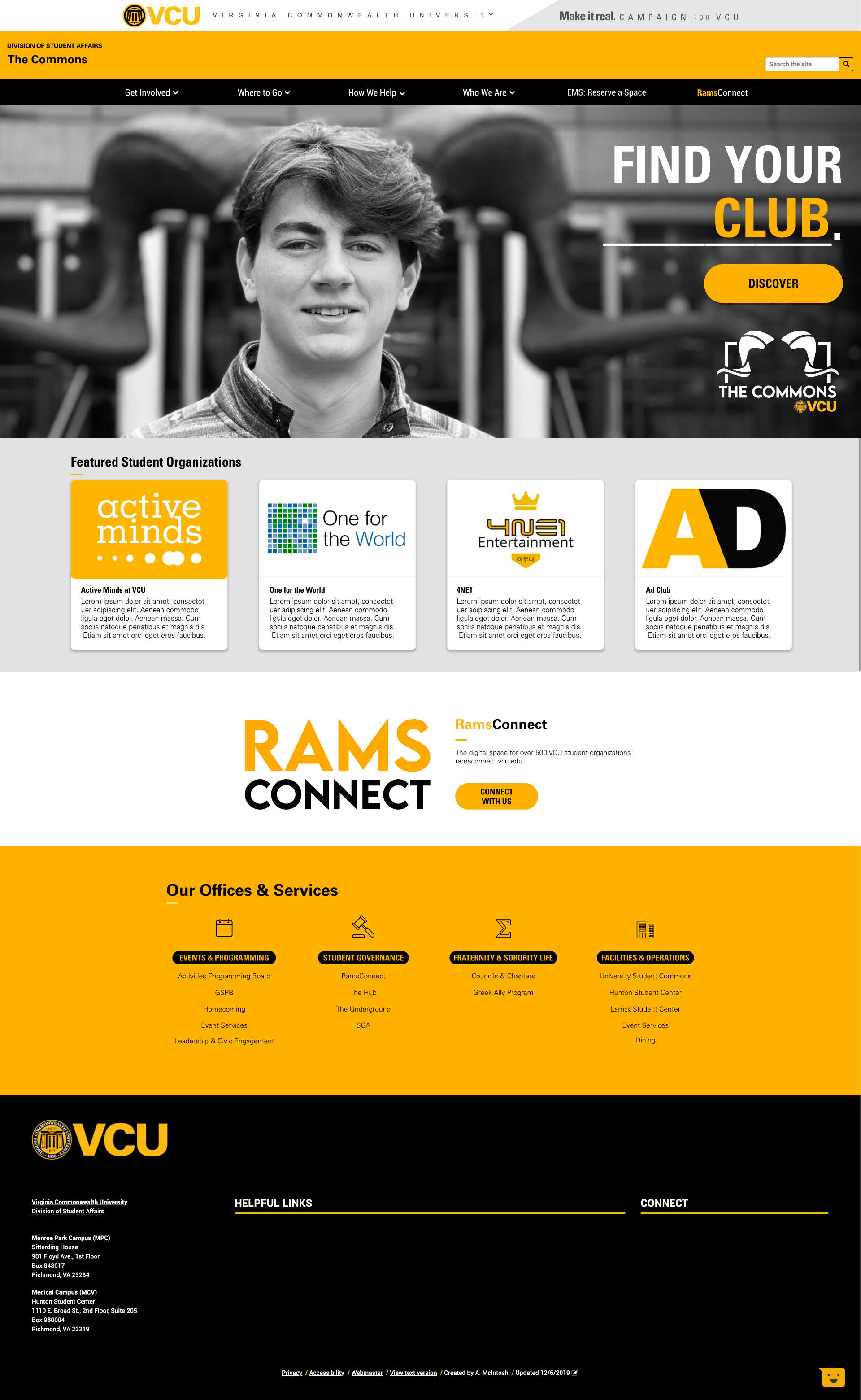
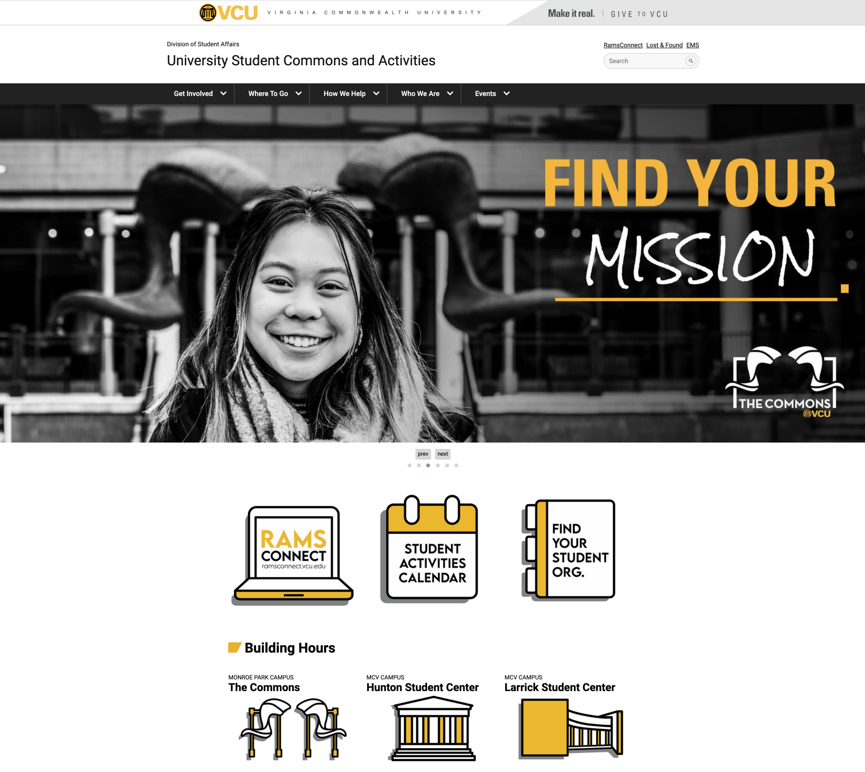
As a Marketing/Design Graduate Assistant, I’ve had the immense privilege of leading a department-wide rebranding initiative for VCU’s University Student Commons & Activities

We sought to improve the way students experienced the USC&A brand, as well as all of its sub-brands, by gaining a comprehensive understanding of what they need to find their place at VCU.

Our team’s work was recently recognized by the industry’s professional organization, the Association of College Unions International, in the annual “Steal This Idea” marketing competition.

First Place Logo/Brand Identity
First Place Website Design

Challenge

Lead the development of a fully rebranded identity & hierarchy, website, and launch campaign for the University Student Commons & Activities (USC&A) at VCU, a sub-brand of Virginia Commonwealth University.

Insight

Students know USC&A’s spaces, programs, events, and opportunities. They even have their own language & landmarks to identify our offerings. They just don’t know it’s us.

Visual Branding

Ram Horns sculpture at VCU

We decided to root The Commons visual identity in existing brand equity, derived from two phrases we kept hearing from students: “The Ram Horns” & “The Commons”

Ram horns logo, The commons, VCU and seal

The new primary logo for The Commons now features a simplified graphic representation of the Ram Horns in the Commons Plaza.

The Commons provides students with a range of services, programs, and spaces through several secondary units. These are a few applications of how the new identity will extend to all brand touchpoints.

In order to strengthen The Commons brand as a whole (which benefits all secondary units through increased recognition), I created a lockup of the primary “Ram Horns” logo mark with stylized type for the unit names.

Type treatment for APB, SLCE, GSPB, FSL

Type treatment for units wishing to indicate their sponsorship of a specific program (with the logo lockup also featured on the collateral).

RamsConnect

RamsConnect, the online portal for students to get involved, receives a similar type treatment to secondary units, but in a two-color, stacked wordmark.

The Commons at Larrick Logo

The new logo also has location lockup options in order to tie all three locations to the department’s operations.

We developed a custom icon set to ensure that interactions across our brand were consistent & easily recognizable.

The Commons Polo Mockup
The Commons Jacket Mockup
The commons bottle mockup

Digital Rebuild

Website Prototype

Prototype of the new homepage of The Commons website, designed to match the new web template for the Division of Student Affairs. The rebranded identity of The Commons was rolled out alongside a new department website & the “Find Your” launch campaign (produced with Chris Cole).

Commons Header Video, "Find Your" Campaign

Concept video for the new website’s homepage hero content

Two computer screens featuring the before and after of The Commons website
CommonsBeforeAfter-01CommonsBeforeAfter-03

Updated site with the “Find Your” launch campaign, redesigned information architecture/navigation elements/content and the new branding for The Commons.

team icon

Lex Jin Coelho: art director/UX designer

Chris Cole: art director/UX designer

timeline icon

Brand identity & hierarchy: 6 weeks

UX/UI design & development: 12 weeks

tools icon

Adobe XD & Illustrator

T4 & HTML/CSS